


IXORA
NP YO 1095 P
IXORA
NP YO 1095 P

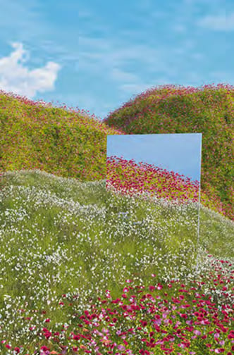
BY THE POND
NP BGG 1746 P
BY THE POND
NP BGG 1746 P
MAGNOLIA
NP OW 2196 P
MAGNOLIA
NP OW 2196 P
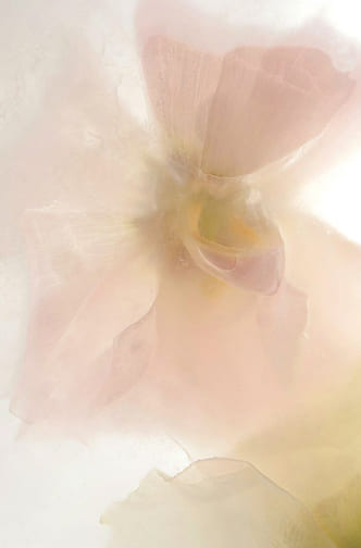
ROSE THOUGHTS
NP R 2320 P
ROSE THOUGHTS
NP R 2320 P
LYCHEE FLOAT
NP R 2280 P
LYCHEE FLOAT
NP R 2280 P
LILAC WHITE
NP OW 2164 P
LILAC WHITE
NP OW 2164 P
COASTAL WATER
NP N 3283 P
COASTAL WATER
NP N 3283 P
KEY COLOUR —RESTFUL SPOT
NP N 3261 P
KEY COLOUR —RESTFUL SPOT
NP N 3261 P


WOVEN STRAW
NP N 3242 P
WOVEN STRAW
NP N 3242 P
NIGHTINGALE
NP N 1836 T
NIGHTINGALE
NP N 1836 T
KEY COLOUR —SWEET MANUKA
NP N 3255 D
KEY COLOUR —SWEET MANUKA
NP N 3255 D
POSTMAN BLUE
NP PB 2895 A
POSTMAN BLUE
NP PB 2895 A
SOPRANO
NP AC 2142 A
SOPRANO
NP AC 2142 A
BRICK HOUSE
NP R 1372 D
BRICK HOUSE
NP R 1372 D
BASKET STRAW
NP BGG 1710 T
BASKET STRAW
NP BGG 1710 T
MUTED EMERALD
NP N 3278 P
MUTED EMERALD
NP N 3278 P
![CMF PALETTE [2] 1 – 2](https://trendbeyondcolours.nipponpaintdecor.com/wp-content/uploads/2025/11/colour-image-29-1.jpg)
![CMF PALETTE [2] 2 – 3](https://trendbeyondcolours.nipponpaintdecor.com/wp-content/uploads/2025/11/colour-image-32-v2.jpg)
![CMF PALETTE [2] 3 – 1](https://trendbeyondcolours.nipponpaintdecor.com/wp-content/uploads/2025/11/colour-image-40.jpg)
![CMF PALETTE [2] 4 – 4](https://trendbeyondcolours.nipponpaintdecor.com/wp-content/uploads/2025/11/colour-image-41-v2.jpg)
![CMF PALETTE [2] 5 – 2](https://trendbeyondcolours.nipponpaintdecor.com/wp-content/uploads/2025/11/colour-image-48-v2.jpg)


WINDSURF
NP PB 1537 P
WINDSURF
NP PB 1537 P
KEY COLOUR —BLUE PLANET
NP PB 1506 D
KEY COLOUR —BLUE PLANET
NP PB 1506 D
BLACK NIGHT
NP N 1995 A
BLACK NIGHT
NP N 1995 A
DARK ENERGY
NP N 3308 D
DARK ENERGY
NP N 3308 D
PALEST GLOW
NP YO 1256 P
PALEST GLOW
NP YO 1256 P
PEARL
NP OW 2230 P
PEARL
NP OW 2230 P
MONSOON LIGHT
NP PB 2936 P
MONSOON LIGHT
NP PB 2936 P
PUMPING IRON
NP N 3064 P
PUMPING IRON
NP N 3064 P
![CMF PALETTE [3] 1 – 1](https://trendbeyondcolours.nipponpaintdecor.com/wp-content/uploads/2025/11/Frame-28.jpg)
![CMF PALETTE [3] 2 – 3](https://trendbeyondcolours.nipponpaintdecor.com/wp-content/uploads/2025/11/Frame-32.jpg)
![CMF PALETTE [3] 3 – 1](https://trendbeyondcolours.nipponpaintdecor.com/wp-content/uploads/2025/11/Frame-40.jpg)
![CMF PALETTE [3] 4 – 4](https://trendbeyondcolours.nipponpaintdecor.com/wp-content/uploads/2025/11/Frame-41.jpg)
![CMF PALETTE [3] 5 – 3](https://trendbeyondcolours.nipponpaintdecor.com/wp-content/uploads/2025/11/Frame-48.jpg)


KEY COLOUR —SPORTS GREEN
NP BGG 2617 A
KEY COLOUR —SPORTS GREEN
NP BGG 2617 A
DIVING POOL
NP BGG 2769 A
DIVING POOL
NP BGG 2769 A
GLITZY BLUE
NP PB 2840 D
GLITZY BLUE
NP PB 2840 D
SAILOR’S CAP
NP PB 2850 P
SAILOR’S CAP
NP PB 2850 P
MELTED CREAM
NP OW 2147 P
MELTED CREAM
NP OW 2147 P
FASCINATION
NP R 1295 A
FASCINATION
NP R 1295 A
PARTY TIME
NP YO 1225 A
PARTY TIME
NP YO 1225 A
ORANGELICIOUS
NP YO 2461 D
ORANGELICIOUS
NP YO 2461 D
![CMF PALETTE [4] 1 – 2](https://trendbeyondcolours.nipponpaintdecor.com/wp-content/uploads/2025/11/image-29.jpg)
![CMF PALETTE [4] 2 – 4](https://trendbeyondcolours.nipponpaintdecor.com/wp-content/uploads/2025/11/Frame-32-v2.jpg)
![CMF PALETTE [4] 3 – 2](https://trendbeyondcolours.nipponpaintdecor.com/wp-content/uploads/2025/11/Frame-40-v2.jpg)
![CMF PALETTE [4] 4 – 2](https://trendbeyondcolours.nipponpaintdecor.com/wp-content/uploads/2025/11/Frame-41-v2.jpg)
![CMF PALETTE [4] 5 – 3](https://trendbeyondcolours.nipponpaintdecor.com/wp-content/uploads/2025/11/Frame-48-v2.jpg)

BASKET STRAW
NP BGG 1710 T
BASKET STRAW
NP BGG 1710 T
PEARL
NP OW 2230 P
PEARL
NP OW 2230 P
IXORA
NP YO 1095 P
IXORA
NP YO 1095 P
KEY COLOUR — SWEET MANUKA
NP N 3255 D
KEY COLOUR — SWEET MANUKA
NP N 3255 D
MAGNOLIA
NP OW 2196 P
MAGNOLIA
NP OW 2196 P
ORANGELICIOUS
NP YO 2461 D
ORANGELICIOUS
NP YO 2461 D
PARTY TIME
NP YO 1225 A
PARTY TIME
NP YO 1225 A
BRICK HOUSE
NP R 1372 D
BRICK HOUSE
NP R 1372 D
SOPRANO
NP AC 2142 A
SOPRANO
NP AC 2142 A
LYCHEE FLOAT
NP R 2280 P
LYCHEE FLOAT
NP R 2280 P
ROSE THOUGHTS
NP R 2320 P
ROSE THOUGHTS
NP R 2320 P
LILAC WHITE
NP OW 2164 P
LILAC WHITE
NP OW 2164 P
FASCINATION
NP R 1295 A
FASCINATION
NP R 1295 A
MONSOON LIGHT
NP PB 2936 P
MONSOON LIGHT
NP PB 2936 P
WINDSURF
NP PB 1537 P
WINDSURF
NP PB 1537 P
KEY COLOUR — BLUE PLANET
NP PB 1506 D
KEY COLOUR — BLUE PLANET
NP PB 1506 D
POSTMAN BLUE
NP PB 2895 A
POSTMAN BLUE
NP PB 2895 A
SAILOR’S CAP
NP PB 2850 P
SAILOR’S CAP
NP PB 2850 P
GLITZY BLUE
NP PB 2840 D
GLITZY BLUE
NP PB 2840 D
KEY COLOUR — RESTFUL SPOT
NP N 3261 P
KEY COLOUR — RESTFUL SPOT
NP N 3261 P
COASTAL WATER
NP N 3283 P
COASTAL WATER
NP N 3283 P
DIVING POOL
NP BGG 2769 A
DIVING POOL
NP BGG 2769 A
BY THE POND
NP BGG 1746 P
BY THE POND
NP BGG 1746 P
KEY COLOUR — SPORTS GREEN
NP BGG 2617 A
KEY COLOUR — SPORTS GREEN
NP BGG 2617 A
WOVEN STRAW
NP N 3242 P
WOVEN STRAW
NP N 3242 P
MELTED CREAM
NP OW 2147 P
MELTED CREAM
NP OW 2147 P
PUMPING IRON
NP N 3064 P
PUMPING IRON
NP N 3064 P
DARK ENERGY
NP N 3308 D
DARK ENERGY
NP N 3308 D
BLACK NIGHT
NP N 1995 A
BLACK NIGHT
NP N 1995 A
NIGHTINGALE
NP N 1836 T
NIGHTINGALE
NP N 1836 T
PEARL
NP OW 2230 P
PEARL
NP OW 2230 P
LYCHEE FLOAT
NP R 2280 P
LYCHEE FLOAT
NP R 2280 P
MONSOON LIGHT
NP PB 2936 P
MONSOON LIGHT
NP PB 2936 P
KEY COLOUR — RESTFUL SPOT
NP N 3261 P
KEY COLOUR — RESTFUL SPOT
NP N 3261 P
PALEST GLOW
NP YO 1256 P
PALEST GLOW
NP YO 1256 P
ROSE THOUGHTS
NP R 2320 P
ROSE THOUGHTS
NP R 2320 P
WINDSURF
NP PB 1537 P
WINDSURF
NP PB 1537 P
BY THE POND
NP BGG 1746 P
BY THE POND
NP BGG 1746 P
BASKET STRAW
NP BGG 1710 T
BASKET STRAW
NP BGG 1710 T
KEY COLOUR — SWEET MANUKA
NP N 3255 D
KEY COLOUR — SWEET MANUKA
NP N 3255 D
BRICK HOUSE
NP R 1372 D
BRICK HOUSE
NP R 1372 D
SOPRANO
NP AC 2142 A
SOPRANO
NP AC 2142 A
SAILOR’S CAP
NP PB 2850 P
SAILOR’S CAP
NP PB 2850 P
GLITZY BLUE
NP PB 2840 D
GLITZY BLUE
NP PB 2840 D
POSTMAN BLUE
NP PB 2895 A
POSTMAN BLUE
NP PB 2895 A
DIVING POOL
NP BGG 2769 A
DIVING POOL
NP BGG 2769 A
PARTY TIME
NP YO 1225 A
PARTY TIME
NP YO 1225 A
FASCINATION
NP R 1295 A
FASCINATION
NP R 1295 A
KEY COLOUR — SPORTS GREEN
NP BGG 2617 A
KEY COLOUR — SPORTS GREEN
NP BGG 2617 A
KEY COLOUR — BLUE PLANET
NP PB 1506 D
KEY COLOUR — BLUE PLANET
NP PB 1506 D
PUMPING IRON
NP N 3064 P
PUMPING IRON
NP N 3064 P
LILAC WHITE
NP OW 2164 P
LILAC WHITE
NP OW 2164 P
DARK ENERGY
NP N 3308 D
DARK ENERGY
NP N 3308 D
BLACK NIGHT
NP N 1995 A
BLACK NIGHT
NP N 1995 A